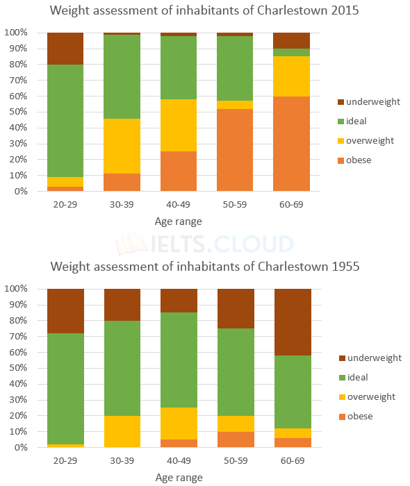
The charts summarise the weight measurements of people living in Charlestown in 1955 and 2015.
Bar-Graph#8 | Social Networking Sites
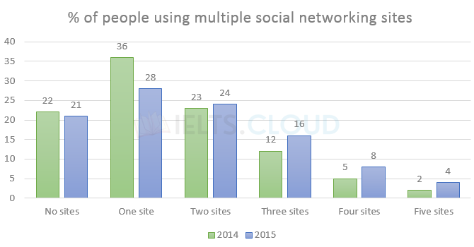
The chart below gives information about the number of social networking sites people used in Canada in 2014 and 2015.
Bar-Graph#7 | People Living in Canada
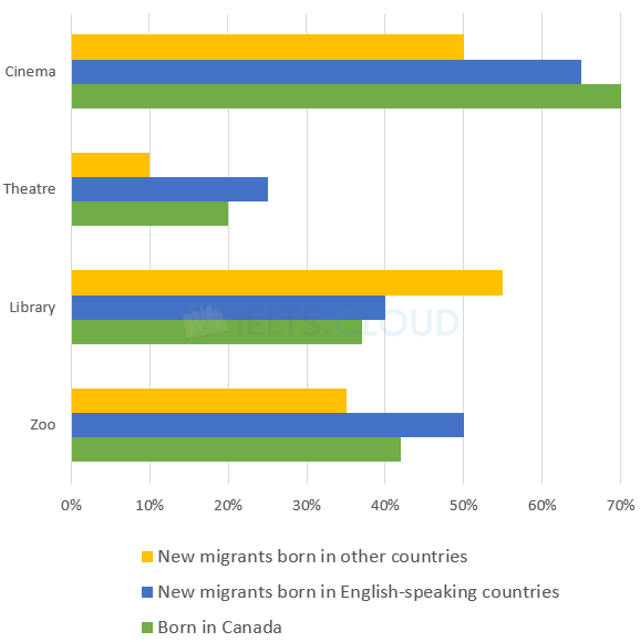
The chart below shows the places visited by different people living in Canada.
Bar-Graph#6 | Canadians
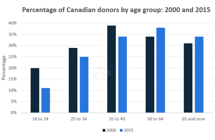
The chart below gives information on the percentage of Canadians gave money to charitable organisations by age range for the years 2000 and 2015.
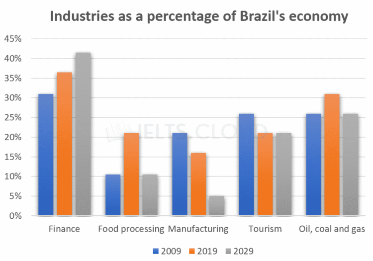
Bar-Graph#5 | Brazil Economy
The bar graph below illustrates five different industries’ percentage share of Brazil’s economy in 2009 and 2019 with a forecast for 2029.
Bar-Graph#5 | Brazil Economy
The bar graph below illustrates five different industries’ percentage share of Brazil’s economy in 2009 and 2019 with a forecast for 2029.
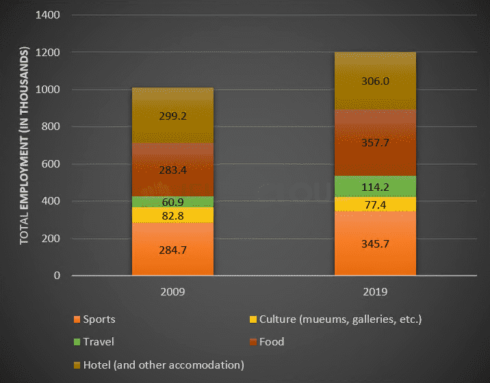
Bar-Graph#4 | Employment Figures
The bar chart below shows employment figures in different tourism-related industries between 2009 and 2019.
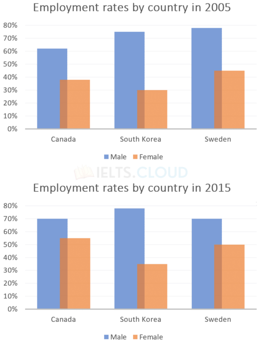
Bar-Graph#3 | Employment Rates
The bar graphs below show the percentages of men and women in employment in three countries in 2005 and 2015.
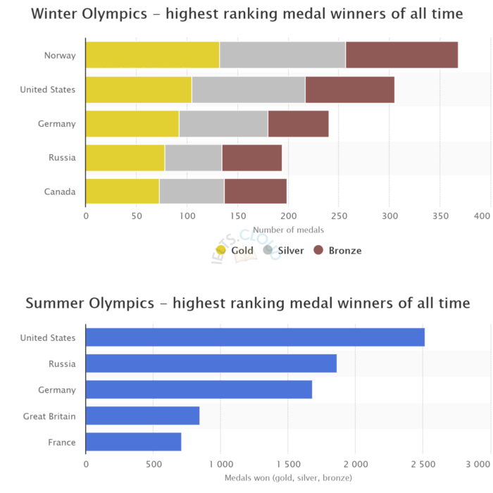
Bar-Graph#2 | Winter Olympics
The graphs below show the number of medals won by the top five countries in the summer and winter Olympics.
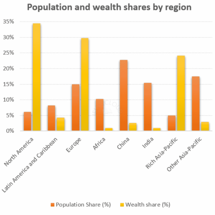
Bar-Graph#1 | Global Population
The chart below gives information about global population percentages and distribution of wealth by region.