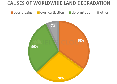
The pie chart below shows the main reasons why agricultural land becomes less productive. The table shows how these causes affected three regions of the world during the 1990s.
Pie-Chart#5 | Reasons for Cycling
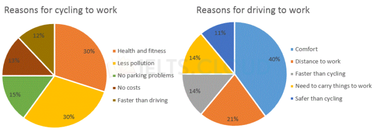
The charts below show the reasons why people travel to work by bicycle or by car.
Pie-Chart#4 | Journal Articles Read per Week
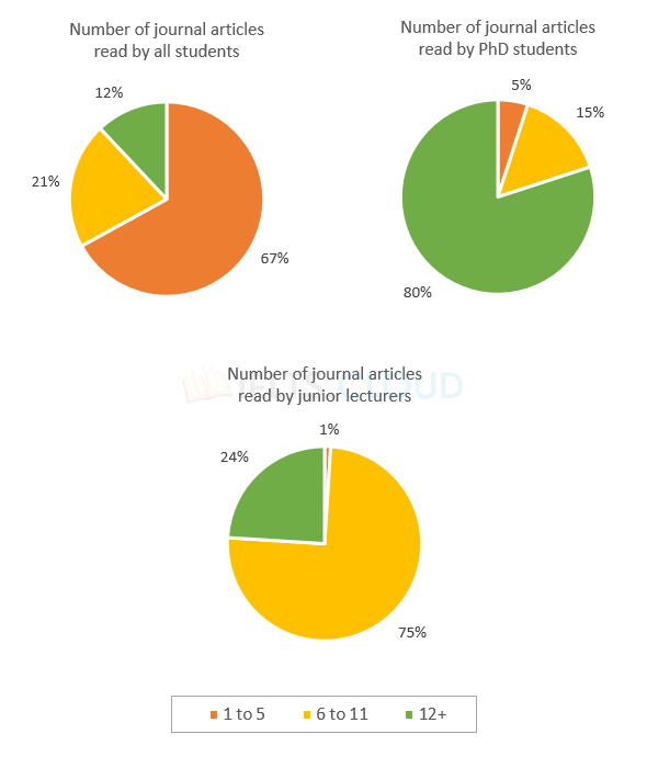
The pie charts below illustrate the number of journal articles read per week by all students, PhD students, and junior lecturers at an Australian university.
Pie-Chart#3 | Advantages and Disadvantages of Bowen Island
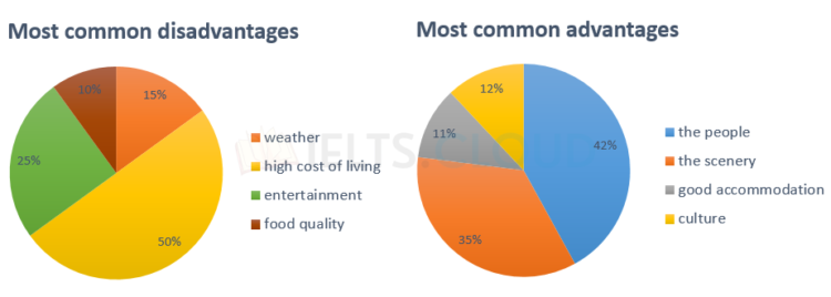
The pie charts below show the most common advantages and disadvantages of Bowen Island, according to a survey of visitors.
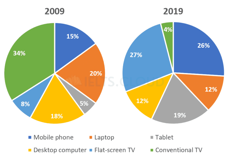
Pie-Chart#2 | Watch Television in Canada
The pie charts below show the devices people in the 18 to 25 age group use to watch television in Canada in two different years.
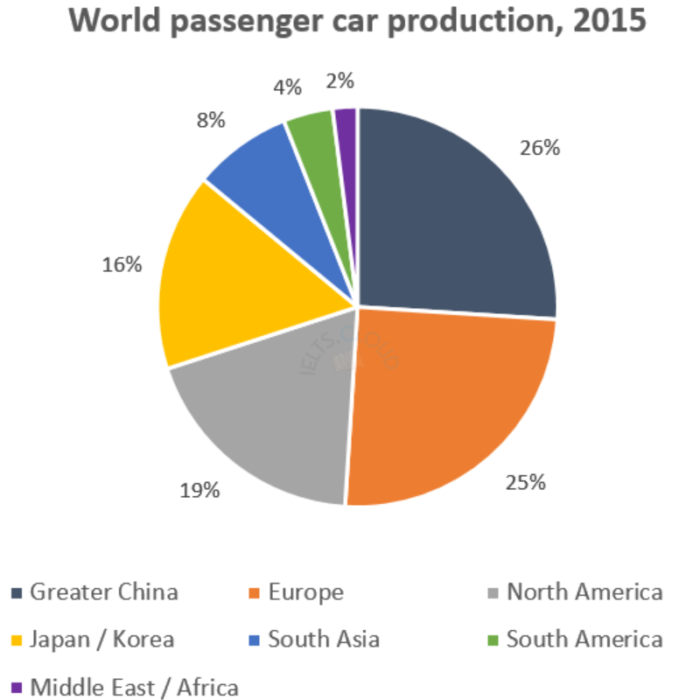
Pie-Chart#1 | Manufacture of Passenger Cars
The pie charts below show the devices people in the 18 to 25 age group use to watch television in Canada in two different years.
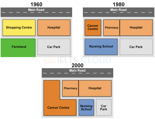
Map#3 | Queen Mary Hospital
The maps below show the changes that have taken place at Queen Mary Hospital since its construction in 1960.
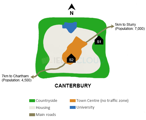
Map#2 | Town of Canterbury
The map below is of the town of Canterbury. A new school (S) is planned for the area. The map shows two possible sites for the school.
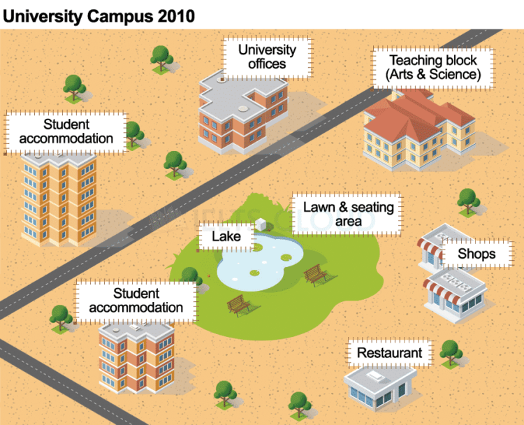
Map#1 | Maps
The maps show improvements that have been made to a university campus between 2010 and the present day.
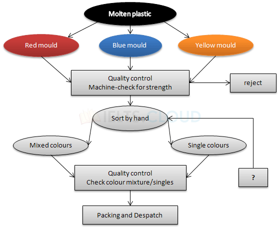
Flowchart#1 | Production Process
The flowchart illustrates the production of coloured plastic paper clips in a small factory.