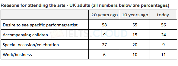
The table below shows the results of a 20-year study into why adults in the UK attend arts events.
Table#1 | Participation of Women
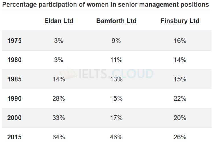
The table below shows the percentage participation of women in senior management in three companies between 1975 and 2015.
Pie-Chart#13 | Managing Finances
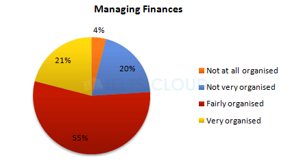
The diagrams below show UK students’ responses to the question of to what extent would they describe themselves as financially organised.

Pie-Chart#13 | Managing Finances
The diagrams below show UK students’ responses to the question of to what extent would they describe themselves as financially organised.

Pie-Chart#12 | Transport and car use in Edmonton
The diagrams below give information on transport and car use in Edmonton.
Pie-Chart#11 | Expenditure by local authorities in Someland
The three pie charts below show the changes in annual spending by local authorities in Someland in 1980, 1990 and 2000.
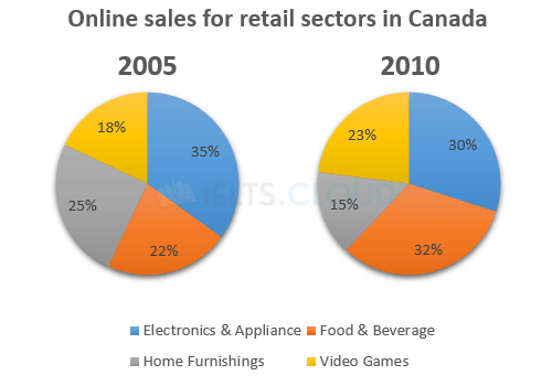
Pie-Chart#10 | Online sales for retail sectors in Canada
The two pie charts below show the online shopping sales for retail sectors in Canada in 2005 and 2010.
Pie-Chart#9 | Employees and self-employed
The two pie charts below show some employment patterns in Great Britain in 1992.
Pie-Chart#8 | Average Household Expenditures
The pie charts below show the average household expenditures in Japan and Malaysia in the year 2010.
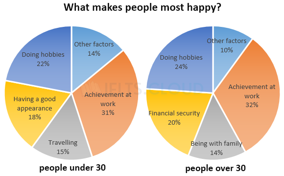
Pie-Chart#7 | What makes people most happy?
The charts below show the results of a survey about what people of different age groups say makes them most happy.