Using the right tenses
It is important to select the correct tenses.
Points to remember:
- For most visuals, a specific time in the past will be given and you will need to use the past simple tense. If two things took place at the same time, you may use the past continuous tense for one of them. (While poultry production was rising during this period, there was no change in mutton production).
- If you use since or recent(ly) it means that you are referring to events that have come up to the present. That means using the present perfect tense. (The use of the Internet has risen enormously since the 1990s.)
- With by you will often need to use the past perfect or the future perfect tense. (By the end of the century the rate of urbanisation had doubled.)
You should spend about 20 minutes on this task.
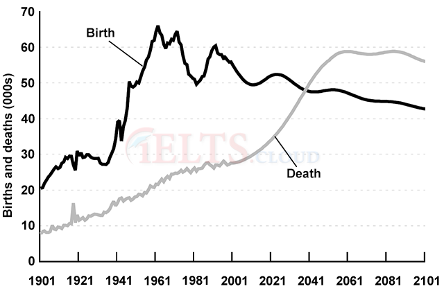
The graph below gives information about changes in the birth and death rates in New Zealand between 1901 and 2101.
Summarise the information by selecting and reporting the main features, and make comparisons where relevant.
Write at least 150 words.

Model answer
The graph shows changes in the birth and death rates in New Zealand since 1901, and forecasts trends tip until 2101.
Between 1901 and the present day, the birth rate has been consistently higher than the death rate. It stood at 20,000 at the start of this period and increased to a peak of 66,000 in 1961. Since then the rate has fluctuated between 65 and 50 thousand and it is expected to decline slowly to around 45,000 births by the end of the century.
In contrast, the death rate started below 10,000 and has increased steadily until the present time. This increase is expected to be more rapid between 2021 and 2051 when the rate will probably level off at around 60,000, before dropping slightly in 2101.
Overall, these opposing trends mean that the death rate will probably overtake the birth rate in around 2041 and the large gap between the two levels will be reversed in the later part of this century.
(164 words)
EXAMINER’S EXPLANATION
This is a strong answer which would score a high IELTS band.
Good points:
- fulfils criteria for length
- introduction is paraphrased
- main sets of data are compared and contrasted
- clear focus on the different trends
- important features of the graph, (e.g. cross-over point) included
- information summarised in conclusion
- well organised information
- range of linkers and referencing expressions
- good range of vocabulary and structures, used accurately


