Categories
  • General – Letter Writing
  • Academic Writing Task 1
  • Bar Graphs
  • IELTS Diagram
  • IELTS Line Graphs
  • IELTS Maps
  • Pie Charts
  • Tables
  • IELTS Writing Task 2
  • Advantages and Disadvantages Essay
  • Discussion Essay
  • Double Question Essay
  • Opinion Essay
  • Problem Solution Essay
  • IELTS General Reading
  • IELTS Academic Reading
  • IELTS Listening
  • IELTS Reading Samples
  • IELTS Speaking
  • Listening Samples
  • IELTS Tips
iELTS.CLOUD-sticky logo
  • Home
  • Listening
  • Reading
    • General Reading
    • Academic Reading
  • IELTS Writing
    • IELTS Writing Task 2
    • IELTS Writing Task 1
  • Speaking
  • IELTS FAQs
  • Home
  • Listening
  • Reading
    • General Reading
    • Academic Reading
  • IELTS Writing
    • IELTS Writing Task 2
    • IELTS Writing Task 1
  • Speaking
  • IELTS FAQs
iELTS.CLOUD-Mobile LogoiELTS.CLOUD-Light LOGO
  • Home
  • Listening
  • Reading
    • General Reading
    • Academic Reading
  • IELTS Writing
    • IELTS Writing Task 2
    • IELTS Writing Task 1
  • Speaking
  • IELTS FAQs
  • Home
  • Listening
  • Reading
    • General Reading
    • Academic Reading
  • IELTS Writing
    • IELTS Writing Task 2
    • IELTS Writing Task 1
  • Speaking
  • IELTS FAQs

Posts Tagged "Line Graphs"

Home » Line Graphs
  • General – Letter Writing
  • Academic Writing Task 1
  • Bar Graphs
  • IELTS Diagram
  • IELTS Line Graphs
  • IELTS Maps
  • Pie Charts
  • Tables
  • IELTS Writing Task 2
  • Advantages and Disadvantages Essay
  • Discussion Essay
  • Double Question Essay
  • Opinion Essay
  • Problem Solution Essay
  • IELTS General Reading
  • IELTS Academic Reading
  • IELTS Listening
  • IELTS Reading Samples
  • IELTS Speaking
  • Listening Samples
  • IELTS Tips
Changes in the price of fresh fruits and vegetables
by AdminWriting, IELTS Academic Writing Task 1, Line Graphs, Line Graphs01/01/2021

Line-Graph#8 | Changes in the price of fresh fruits and vegetables

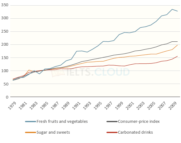
The graph below shows relative price changes for fresh fruits and vegetables, sugars and sweets, and carbonated drinks between 1978 and 2009.

24
Read More
Pollution levels in London
by AdminWriting, IELTS Academic Writing Task 1, Line Graphs, Line Graphs01/01/2021

Line-Graph#7 | Pollution levels in London

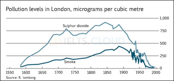
The graph below shows the pollution levels in London between 1600 and 2000.

32
Read More
Population growth in India and China
by AdminWriting, IELTS Academic Writing Task 1, Line Graphs, Line Graphs01/01/2021

Line-Graph#6 | Population growth in India and China

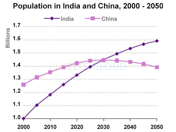
The graph below shows population figures for India and China since the year 2000 and predicted population growth up until 2050.

23
Read More
Free time activities of the elderly in the U.S.
by AdminWriting, IELTS Academic Writing Task 1, Line Graphs, Line Graphs01/01/2021

Line-Graph#5 | Free time activities of the elderly in the U.S.

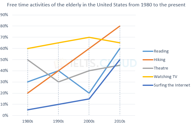
The graph below shows how elderly people in the United States spent their free time between 1980 and 2010.

46
Read More
The chart below shows the changes that took place in three different areas of crime in Panama City from 2010 to 2019.
by AdminWriting, IELTS Academic Writing Task 1, Line Graphs, Line Graphs01/01/2021

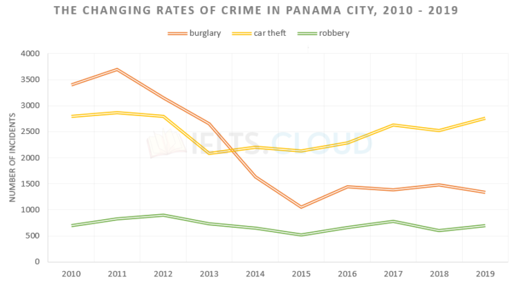
Line-Graph#4 | Crime in Panama City

The chart below shows the changes that took place in three different areas of crime in Panama City from 2010 to 2019.

17
Read More
Children
by AdminWriting, IELTS Academic Writing Task 1, Line Graphs, Line Graphs01/01/2021

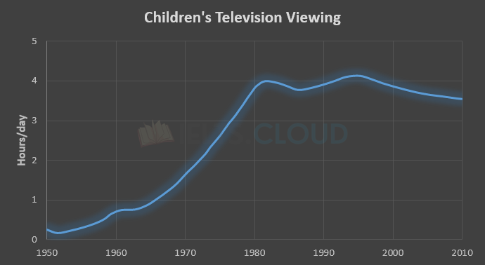
Line-Graph#3 | Children’s Television Viewing

The graph below shows the number of hours per day on average that children spent watching television between 1950 and 2010.

8
Read More
IELTS_Writing_Task_1_LineGraph_2
by AdminWriting, IELTS Academic Writing Task 1, Line Graphs, Line Graphs01/01/2021

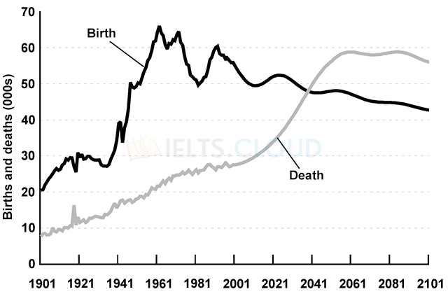
Line-Graph#2 | Birth and Death Rates in New Zealand

The graph below gives information about changes in the birth and death rates in New Zealand between 1901 and 2101.

21
Read More
line GRAPH international museums
by AdminWriting, IELTS Academic Writing Task 1, Line Graphs, Line Graphs01/01/2021

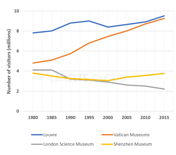
Line-Graph#1 | International Museums

The line graph shows the number of visitors to four international museums between 1980 and 2015.

18
Read More
Popular Tutorials
  • Bar Graphs
  • IELTS Interviews
  • IELTS Writing Task 2
  • IELTS Line Graphs
  • Pie Charts
Terms of Use

The reading, writing and listening practice tests in IELTS.CLOUD have been designed to resemble the format of the IELTS test as closely as possible. They are not, however, real IELTS tests; they are designed to practise exam technique to help students to face the IELTS test with confidence and to perform to the best of their ability. While using this site, you agree to have read and accepted our terms of use, cookie and privacy policy.

© 2020 IELTS.CLOUD | All rights reserved
  • Privacy Policy